# This line configures matplotlib to show figures embedded in the notebook,
# instead of opening a new window for each figure, similar to Exercise-0-Jupyter
%matplotlib inlineMatplotlib - 2D and 3D plotting in Python
Introduction
Matplotlib is an excellent 2D and 3D graphics library for generating scientific figures. Some of the many advantages of this library include:
- Easy to get started
- Great control of every element in a figure, including figure size and DPI.
- High-quality output in many formats, including PNG, PDF, SVG, EPS, and PGF.
- GUI for interactively exploring figures and support for headless generation of figure files (useful for batch jobs).
One of the key features of matplotlib that I would like to emphasize, and that I think makes matplotlib highly suitable for generating figures for scientific publications is that all aspects of the figure can be controlled programmatically. This is important for reproducibility and convenient when one needs to regenerate the figure with updated data or change its appearance.
More information at the Matplotlib web page: http://matplotlib.org/
To get started using Matplotlib in a Python program, either include the symbols from the pylab module (the easy way):
from pylab import *or import the matplotlib.pyplot module under the name plt (the tidy way):
import matplotlib
import matplotlib.pyplot as plt
import numpy as npMATLAB-like API
The easiest way to get started with plotting using matplotlib is often to use the MATLAB-like API provided by matplotlib.
It is designed to be compatible with MATLAB’s plotting functions, so it is easy to get started with if you are familiar with MATLAB.
To use this API from matplotlib, we need to include the symbols in the pylab module:
from pylab import *Example
A simple figure with MATLAB-like plotting API:
x = np.linspace(0, 5, 10)
y = x ** 2
figure()
plot(x, y, 'r')
xlabel('x')
ylabel('y')
title('title')
show()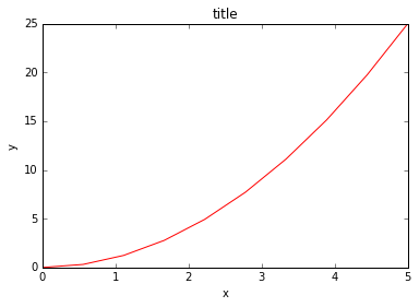
Most of the plotting related functions in MATLAB are covered by the pylab module. For example, subplot and color/symbol selection:
subplot(1,2,1)
plot(x, y, 'r--')
subplot(1,2,2)
plot(y, x, 'g*-');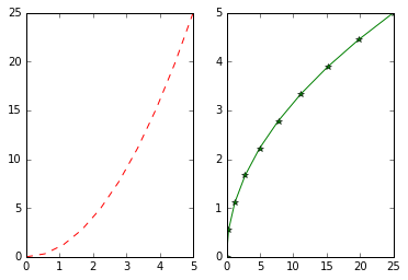
The good thing about the pylab MATLAB-style API is that it is easy to get started with if you are familiar with MATLAB, and it has a minumum of coding overhead for simple plots.
However, I’d encourrage not using the MATLAB compatible API for anything but the simplest figures.
Instead, I recommend learning and using matplotlib’s object-oriented plotting API. It is remarkably powerful. For advanced figures with subplots, insets and other components it is very nice to work with.
The matplotlib object-oriented API
The main idea with object-oriented programming is to have objects that one can apply functions and actions on, and no object or program states should be global (such as the MATLAB-like API). The real advantage of this approach becomes apparent when more than one figure is created, or when a figure contains more than one subplot.
To use the object-oriented API we start out very much like in the previous example, but instead of creating a new global figure instance we store a reference to the newly created figure instance in the fig variable, and from it we create a new axis instance axes using the add_axes method in the Figure class instance fig:
fig = plt.figure()

axes = fig.add_axes([0.1, 0.1, 0.8, 0.8]) # left, bottom, width, height (range 0 to 1)

axes.plot(x, y, 'r')

axes.set_xlabel('x')
axes.set_ylabel('y')
axes.set_title('title');
Although a little bit more code is involved, the advantage is that we now have full control of where the plot axes are placed, and we can easily add more than one axis to the figure:
fig = plt.figure()

axes1 = fig.add_axes([0.1, 0.1, 0.8, 0.8]) # main axes
axes2 = fig.add_axes([0.2, 0.5, 0.4, 0.3]) # inset axes

# main figure
axes1.plot(x, y, 'r')
axes1.set_xlabel('x')
axes1.set_ylabel('y')
axes1.set_title('title')

# insert
axes2.plot(y, x, 'g')
axes2.set_xlabel('y')
axes2.set_ylabel('x')
axes2.set_title('insert title');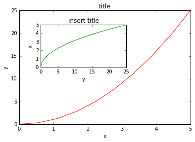
If we don’t care about being explicit about where our plot axes are placed in the figure canvas, then we can use one of the many axis layout managers in matplotlib. My favorite is subplots, which can be used like this:
fig, axes = plt.subplots()

axes.plot(x, y, 'r')
axes.set_xlabel('x')
axes.set_ylabel('y')
axes.set_title('title');
fig, axes = plt.subplots(nrows=1, ncols=2)

for ax in axes:
    ax.plot(x, y, 'r')
    ax.set_xlabel('x')
    ax.set_ylabel('y')
    ax.set_title('title')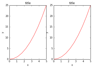
That was easy, but it isn’t so pretty with overlapping figure axes and labels, right?
We can deal with that by using the fig.tight_layout method, which automatically adjusts the positions of the axes on the figure canvas so that there is no overlapping content:
fig, axes = plt.subplots(nrows=1, ncols=2)

for ax in axes:
    ax.plot(x, y, 'r')
    ax.set_xlabel('x')
    ax.set_ylabel('y')
    ax.set_title('title')

fig.tight_layout()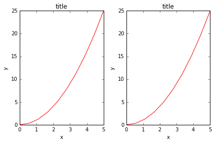
Saving figures
To save a figure to a file we can use the savefig method in the Figure class:
fig.savefig("filename.png")What formats are available and which ones should be used for best quality?
Matplotlib can generate high-quality output in a number formats, including PNG, JPG, EPS, SVG, PGF and PDF. For scientific papers, I recommend using PDF whenever possible. (LaTeX documents compiled with pdflatex can include PDFs using the includegraphics command). In some cases, PGF can also be good alternative.
Legends, labels and titles
Now that we have covered the basics of how to create a figure canvas and add axes instances to the canvas, let’s look at how decorate a figure with titles, axis labels, and legends.
Figure titles
A title can be added to each axis instance in a figure. To set the title, use the set_title method in the axes instance:
ax.set_title("title");Axis labels
Similarly, with the methods set_xlabel and set_ylabel, we can set the labels of the X and Y axes:
ax.set_xlabel("x")
ax.set_ylabel("y");
Legends
Legends for curves in a figure can be added in two ways. One method is to use the legend method of the axis object and pass a list/tuple of legend texts for the previously defined curves:
ax.legend(["curve1", "curve2", "curve3"]);The method described above follows the MATLAB API. It is somewhat prone to errors and unflexible if curves are added to or removed from the figure (resulting in a wrongly labelled curve).
A better method is to use the label="label text" keyword argument when plots or other objects are added to the figure, and then using the legend method without arguments to add the legend to the figure:
ax.plot(x, x**2, label="curve1")
ax.plot(x, x**3, label="curve2")
ax.legend();
The advantage with this method is that if curves are added or removed from the figure, the legend is automatically updated accordingly.
The legend function takes an optional keyword argument loc that can be used to specify where in the figure the legend is to be drawn. The allowed values of loc are numerical codes for the various places the legend can be drawn. See http://matplotlib.org/users/legend_guide.html#legend-location for details. Some of the most common loc values are:
ax.legend(loc=0) # let matplotlib decide the optimal location
ax.legend(loc=1) # upper right corner
ax.legend(loc=2) # upper left corner
ax.legend(loc=3) # lower left corner
ax.legend(loc=4) # lower right corner
# .. many more options are available
The following figure shows how to use the figure title, axis labels and legends described above:
fig, ax = plt.subplots()

ax.plot(x, x**2, label="y = x**2")
ax.plot(x, x**3, label="y = x**3")
ax.legend(loc=2); # upper left corner
ax.set_xlabel('x')
ax.set_ylabel('y')
ax.set_title('title');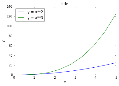
Setting colors, linewidths, linetypes
Colors
With matplotlib, we can define the colors of lines and other graphical elements in a number of ways. First of all, we can use the MATLAB-like syntax where 'b' means blue, 'g' means green, etc. The MATLAB API for selecting line styles are also supported: where, for example, ‘b.-’ means a blue line with dots:
# MATLAB style line color and style
ax.plot(x, x**2, 'b.-') # blue line with dots
ax.plot(x, x**3, 'g--') # green dashed line
We can also define colors by their names or RGB hex codes and optionally provide an alpha value using the color and alpha keyword arguments:
fig, ax = plt.subplots()

ax.plot(x, x+1, color="red", alpha=0.5) # half-transparant red
ax.plot(x, x+2, color="#1155dd")        # RGB hex code for a bluish color
ax.plot(x, x+3, color="#15cc55")        # RGB hex code for a greenish color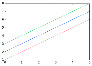
Line and marker styles
To change the line width, we can use the linewidth or lw keyword argument. The line style can be selected using the linestyle or ls keyword arguments:
fig, ax = plt.subplots(figsize=(12,6))

ax.plot(x, x+1, color="blue", linewidth=0.25)
ax.plot(x, x+2, color="blue", linewidth=0.50)
ax.plot(x, x+3, color="blue", linewidth=1.00)
ax.plot(x, x+4, color="blue", linewidth=2.00)

# possible linestype options ‘-‘, ‘--’, ‘-.’, ‘:’, ‘steps’
ax.plot(x, x+5, color="red", lw=2, linestyle='-')
ax.plot(x, x+6, color="red", lw=2, ls='-.')
ax.plot(x, x+7, color="red", lw=2, ls=':')

# custom dash
line, = ax.plot(x, x+8, color="black", lw=1.50)
line.set_dashes([5, 10, 15, 10]) # format: line length, space length, ...

# possible marker symbols: marker = '+', 'o', '*', 's', ',', '.', '1', '2', '3', '4', ...
ax.plot(x, x+ 9, color="green", lw=2, ls='--', marker='+')
ax.plot(x, x+10, color="green", lw=2, ls='--', marker='o')
ax.plot(x, x+11, color="green", lw=2, ls='--', marker='s')
ax.plot(x, x+12, color="green", lw=2, ls='--', marker='1')

# marker size and color
ax.plot(x, x+13, color="purple", lw=1, ls='-', marker='o', markersize=2)
ax.plot(x, x+14, color="purple", lw=1, ls='-', marker='o', markersize=4)
ax.plot(x, x+15, color="purple", lw=1, ls='-', marker='o', markersize=8, markerfacecolor="red")
ax.plot(x, x+16, color="purple", lw=1, ls='-', marker='s', markersize=8,
        markerfacecolor="yellow", markeredgewidth=2, markeredgecolor="blue");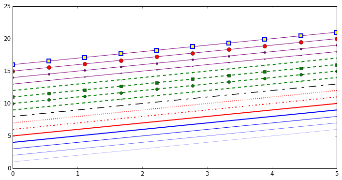
Control over axis appearance
The appearance of the axes is an important aspect of a figure that we often need to modify to make a publication quality graphics. We need to be able to control where the ticks and labels are placed, modify the font size and possibly the labels used on the axes. In this section we will look at controling those properties in a matplotlib figure.
Plot range
The first thing we might want to configure is the ranges of the axes. We can do this using the set_ylim and set_xlim methods in the axis object, or axis('tight') for automatrically getting “tightly fitted” axes ranges:
fig, axes = plt.subplots(1, 3, figsize=(12, 4))

axes[0].plot(x, x**2, x, x**3)
axes[0].set_title("default axes ranges")

axes[1].plot(x, x**2, x, x**3)
axes[1].axis('tight')
axes[1].set_title("tight axes")

axes[2].plot(x, x**2, x, x**3)
axes[2].set_ylim([0, 60])
axes[2].set_xlim([2, 5])
axes[2].set_title("custom axes range");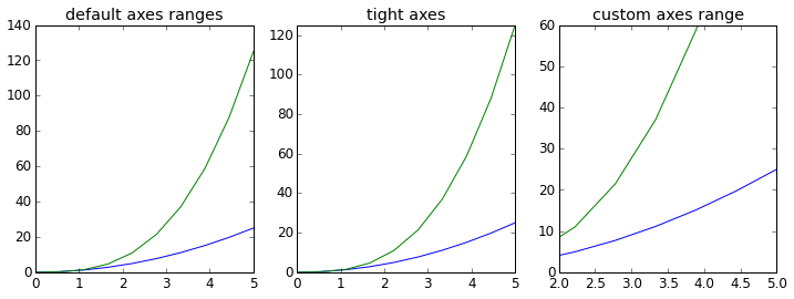
Logarithmic scale
It is also possible to set a logarithmic scale for one or both axes. This functionality is in fact only one application of a more general transformation system in Matplotlib. Each of the axes’ scales are set seperately using set_xscale and set_yscale methods which accept one parameter (with the value “log” in this case):
fig, axes = plt.subplots(1, 2, figsize=(10,4))

axes[0].plot(x, x**2, x, np.exp(x))
axes[0].set_title("Normal scale")

axes[1].plot(x, x**2, x, np.exp(x))
axes[1].set_yscale("log")
axes[1].set_title("Logarithmic scale (y)");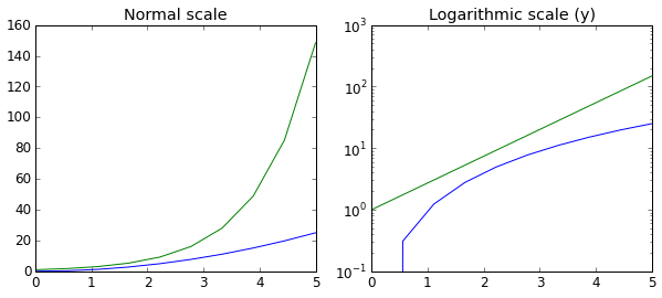
Scientific notation
With large numbers on axes, it is often better use scientific notation:
fig, ax = plt.subplots(1, 1)

ax.plot(x, x**2, x, np.exp(x))
ax.set_title("scientific notation")

ax.set_yticks([0, 50, 100, 150])

from matplotlib import ticker
formatter = ticker.ScalarFormatter(useMathText=True)
formatter.set_scientific(True)
formatter.set_powerlimits((-1,1))
ax.yaxis.set_major_formatter(formatter) 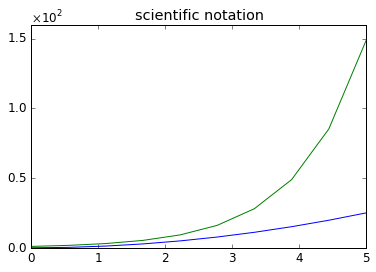
Axis grid
With the grid method in the axis object, we can turn on and off grid lines. We can also customize the appearance of the grid lines using the same keyword arguments as the plot function:
fig, axes = plt.subplots(1, 2, figsize=(10,3))

# default grid appearance
axes[0].plot(x, x**2, x, x**3, lw=2)
axes[0].grid(True)

# custom grid appearance
axes[1].plot(x, x**2, x, x**3, lw=2)
axes[1].grid(color='b', alpha=0.5, linestyle='dashed', linewidth=0.5)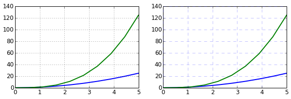
Axes where x and y is zero
fig, ax = plt.subplots()

ax.spines['right'].set_color('none')
ax.spines['top'].set_color('none')

ax.xaxis.set_ticks_position('bottom')
ax.spines['bottom'].set_position(('data',0)) # set position of x spine to x=0

ax.yaxis.set_ticks_position('left')
ax.spines['left'].set_position(('data',0))   # set position of y spine to y=0

xx = np.linspace(-0.75, 1., 100)
ax.plot(xx, xx**3);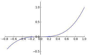
Other 2D plot styles
In addition to the regular plot method, there are a number of other functions for generating different kind of plots. See the matplotlib plot gallery for a complete list of available plot types: http://matplotlib.org/gallery.html. Some of the more useful ones are show below:
n = np.array([0,1,2,3,4,5])fig, axes = plt.subplots(1, 4, figsize=(12,3))
axes[0].scatter(xx, xx + 0.25*np.random.randn(len(xx)))
axes[0].set_title("scatter")
axes[1].step(n, n**2, lw=2)
axes[1].set_title("step")
axes[2].bar(n, n**2, align="center", width=0.5, alpha=0.5)
axes[2].set_title("bar")
axes[3].fill_between(x, x**2, x**3, color="green", alpha=0.5);
axes[3].set_title("fill_between");
# A histogram
n = np.random.randn(100000)
fig, axes = plt.subplots(1, 2, figsize=(12,4))

axes[0].hist(n)
axes[0].set_title("Default histogram")
axes[0].set_xlim((min(n), max(n)))

axes[1].hist(n, cumulative=True, bins=50)
axes[1].set_title("Cumulative detailed histogram")
axes[1].set_xlim((min(n), max(n)));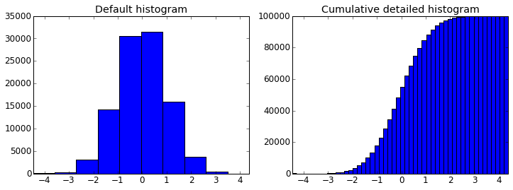
Further reading
- http://www.matplotlib.org - The project web page for matplotlib.
- https://github.com/matplotlib/matplotlib - The source code for matplotlib.
- http://matplotlib.org/gallery.html - A large gallery showcaseing various types of plots matplotlib can create. Highly recommended!
- http://www.loria.fr/~rougier/teaching/matplotlib - A good matplotlib tutorial.
- http://scipy-lectures.github.io/matplotlib/matplotlib.html - Another good matplotlib reference.
Versions
%reload_ext version_information
%version_information numpy, scipy, matplotlib| Software | Version |
| Python | 2.7.10 64bit [GCC 4.2.1 (Apple Inc. build 5577)] |
| IPython | 3.2.1 |
| OS | Darwin 14.1.0 x86_64 i386 64bit |
| numpy | 1.9.2 |
| scipy | 0.16.0 |
| matplotlib | 1.4.3 |
| Sat Aug 15 11:30:23 2015 JST | |
